


Value Vector: Unemployment & Financial Markets
Value Vector: Unemployment & Financial Markets
Where will the stock market go in this new rate cycle?

In March 2009, my middle school math teacher, a golf-loving Irishman from Cork, introduced me to paper trading.
The final project for our class was to “invest” a $1000 portfolio (on paper), and try to optimize its performance by “buying and selling” different public equities. To keep us honest, we were instructed to submit our trades every Monday before the market opened.
Over the course of those 12 weeks, I generated a 73% return — which on an annualized basis, was on track to 10X my principal. Had I continued this streak, I’d be well on my way to becoming the world’s first quadrillionaire!

Did I waste my life pursuing physics? Should I have instead dedicated myself to generating alpha? What was this mythical portfolio strategy, you ask? Behold!
The Strategy: I bought 336 shares of Apple (AAPL) at $2.97 on March 9th — and held them all until the last day of class, June 8th.
On that date, the share price had risen to $5.14 a share. - a whopping annualized return of over 1085%.
So was I some sort of investing savant as a preteen? No!
Like every other late millennial teen, I was just obsessed with my friend’s iPhone and iPod Touch. Sometimes it pays to be lucky.
At the time, I was pretty happy with myself. Sure I didn’t have $1000 to actually invest — but if I did, I would have made over $700 — which was more money than I could even imagine at the time!
What I didn’t know then was that March 2009 was a pivotal point in financial history. Unemployment was at a 30-year high, interest rates were near 0%, and the stock market had bottomed out that very month, after dropping over 60% from its peak in 2007. Anyone that threw money into the stock market at this time would have made a killing.
Indeed, my entire teenage years through young adult life has been a special time where stocks invariably go up.

If instead of buying Apple, I had just bought the S&P on that fateful day in March 2009, I would have still generated 50% return over 12 weeks — and $1,000 back then would be $8,636 today! My good fortune (dumb luck) at the time blinded me to the long term cycles that actually drive growth and decline in financial markets.
Now I am older, and moderately wiser — and in light of the new rate cut cycle being initiated last week — this seems like an appropriate time to discuss the macro-trends to which my younger self was blissfuly ignorant. So in this Value Vector, we’re going to explore how the business cycle and the real economy, affects valuation of public equities in the financial economy.
Stock Markets (a proxy for profits)
The stock market serves many functions, but here are its three main purposes as I see it:
Provides liquidity for investors (the ability to freely buy/sell shares with cash).
Enables profit sharing (from the company to employees, board members, investors, etc.)
Gives companies easy access to fundraising (by issuing new shares through dilutive public offerings).
In aggregate, they primarily serve as a proxy for business profits. The more net profits a company generates, the larger the dividends or reinvestments into growth — which ultimately drives stock prices higher.
This means employment levels, which contribute to the total costs accrued by a business, have a direct correlation with the value of a companies outstanding shares. To understand why, we’ll first break down two key business and financial metrics: profit margins and PE Ratios.
Invariant & Dimensionless Quantities (how to price a stock)
When studying physical systems, physicists like to measure (and use models to predict) values that are called invariant and dimensionless (I&D) quantities. These pure numbers serve as metrics that define the relevant dynamics of the system.
When a number is invariant, we can bank on certain key product indicators (KPIs) of a business rising/falling, when others fall/rise. For example, if I have a company that generated:
$10 million in revenue from 1 million customers this month, and
$12 million in revenue from 1.2 million customers next month,
Then their Average Revenue Per Customer (ARPC) is an invariant quantity of $10/customer - it was the same month-over-month.
Likewise when a number is dimensionless, it is not sensitive to the background behavior of the system. Suppose we have an industry that is rapidly growing revenue. A dimensionful metric would be one that measures performance per clients (like ARPC for example) — whereas a dimensionless metric measures performance independent.
These quantities are useful because they make sense regardless what the size of the business is - and they tell us something about the growth potential in a size invariant way.
PE Ratios
PE Ratios and profit margins are often treated as invariant quantities because they remain relatively stable across market cycles. This stability occurs because companies tend to manage costs and profits in a way that keeps their earnings per share (EPS) consistent with the broader market's expectations.
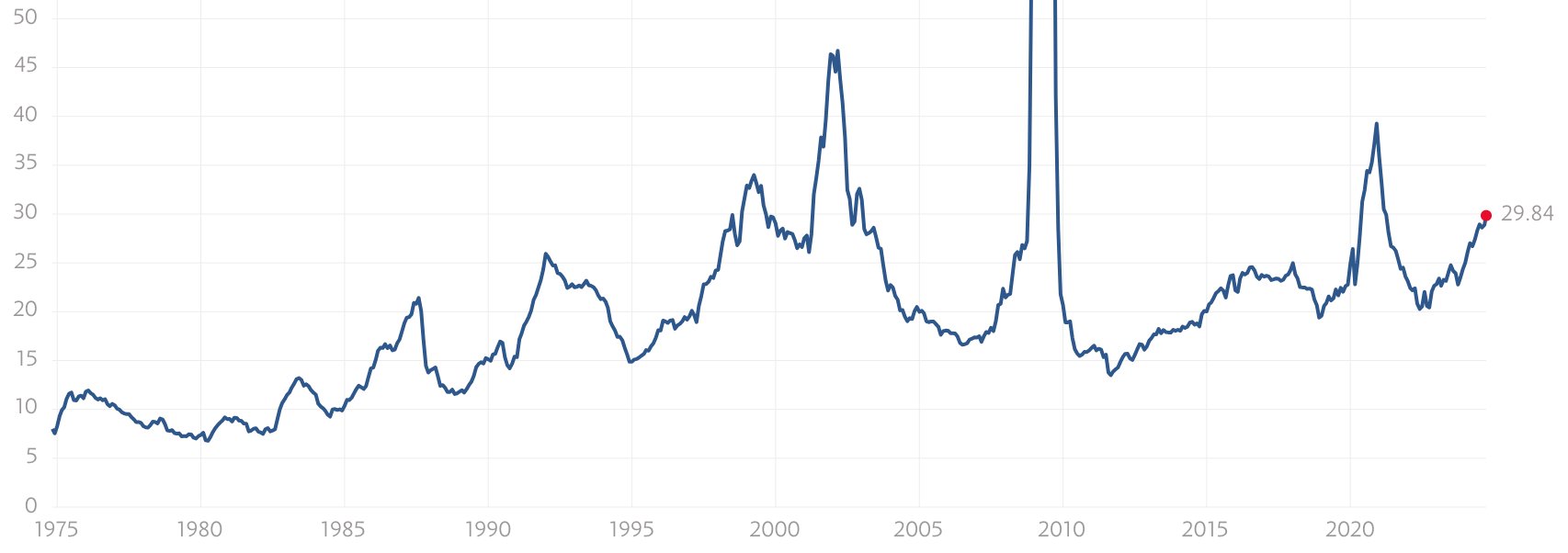
PE Ratios typically climb sharply to signal the start of a recession because the market has not yet priced in the fall in revenue. Since revenues fall before costs are cut, earnings will drop quickly and unexpectedly, leading to an abrupt (but temporary) rise in PE ratios. (shown below):
Profit Margins
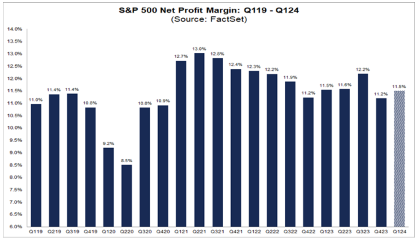
Profit Margins are similarly indicative of company health. When margins dip during economic slowdowns, it’s often due to declining revenue with fixed costs not adjusting as quickly. However, as companies react by cutting costs (with labor usually being the first to go), margins typically bounce back to baseline levels — generally around 11.2% for the S&P 500.
These two metrics are crucial in pricing a stock because they are forward-looking indicators of market sentiment. Investors use them to gauge whether companies will continue growing or face pressure from the macroeconomic environment.
We can now use these two parameters to better understand what drives stock price growth amid shifts in the real economy, influenced by the business cycle. The typical values for these I&D parameters are:
PE Ratio: ~25 (±5)
Profit Margins: 11.2% (±1%)
These values remain relatively stable throughout short-term capital market cycles, which has key implications for pricing dividend-bearing stocks, as we'll explore next.
Employment Cycle (Recessions & Stock Valuations)
During recessions, reduced demand for goods and services drives down revenue. To maintain profitability, companies cut operating costs (OPEX) to preserve fixed profit margins, which in turn lowers net income. As earnings fall, equity valuations must drop to keep PE ratios steady around 25, depending on the industry.
Unemployment serves as a delayed indicator of these contractions. When unemployment rises, companies cut labor and fixed costs, depressing earnings and stock prices, all while keeping profits fixed at 11.2% on average.
After playing around with some data, I found that Historical trends show the trailing-twelve-month (TTM) unemployment rate as a strong inverse indicator for stock market performance. Peaks in unemployment often trail recessions by about 12 months.
In short, unemployment is anti-correlated with stock market growth, and this relationship can be modeled explicitly.
A Model for Public Equities
So now we have everything we need to answer the following question:
How do public equities respond to the business cycle?
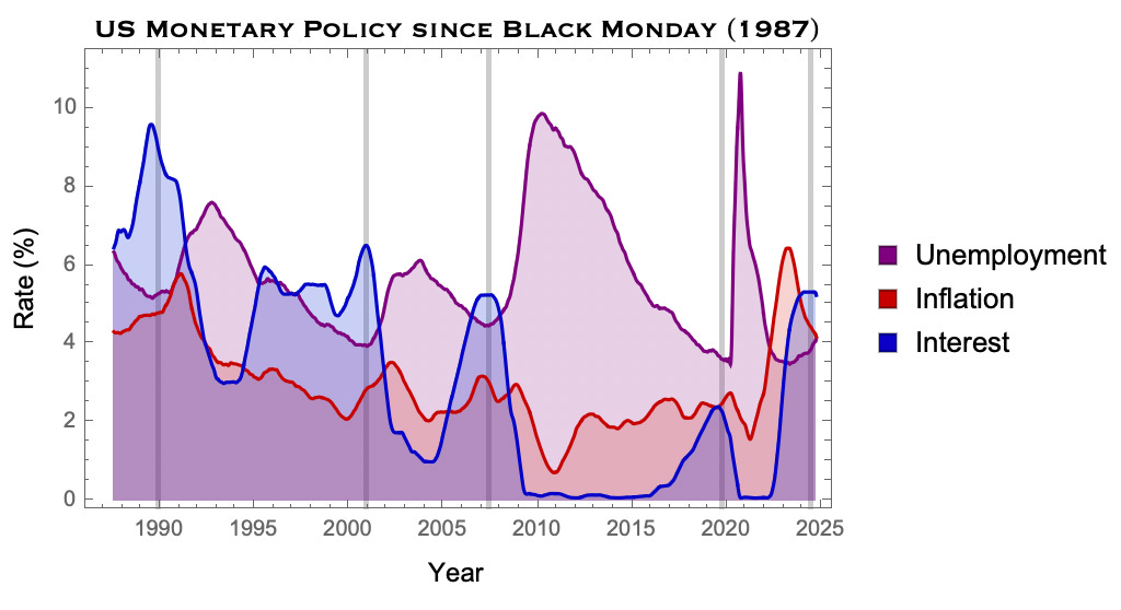
Let’s take a look at a plot from the last newsletter. As we mentioned, unemployment is typically driven by external factors of monetary policy and market shifts. This creates a feedback look that look something like the following:
Given what we now know, here is roughly our model for the the price of the stock market over time:
Ok so this is a fairly simple model. I trained my machine to learn the real world values given historical ticker data and this is what I found:
Model Parameters from Real World Data:
Annualized growth of S&P, S = 9.2%
Ratio of cost of labor (not just payroll) to OPEX), C = 0.32
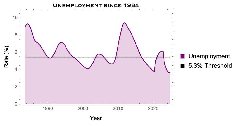
Baseline unemployment, R0 = 5.3%
The starting ticker price of S&P, P0 = 17, in the year, Y0 = 1928
As we mentioned last week, R(Y), i.e. the unemployment rate over time, is just a bunch of trig functions with period of about 7-9 years.
I’ve also included a Levy flight random variable if you really wanted to get into the weeds with this model, X^levy, with tail degree, nu.
So here is the model with fixed parameters, constrained by empirically sampled data:
This is great, but I admit not very practical. In the world of business and finance, we don’t just want models — we want deep human intuition that is actually operable.
A sharp model is useless without an intuitive understanding of its features.
Moreover, while I might be a Cornell trained physicist and a Cambridge trained mathematician, I personally find the symbolic expressions like this pretty uninformative. So to gain a better understanding of what this model actually does, let’s plot it and play around with some historical data.
The Unemployment to Stock Market Model in Practice
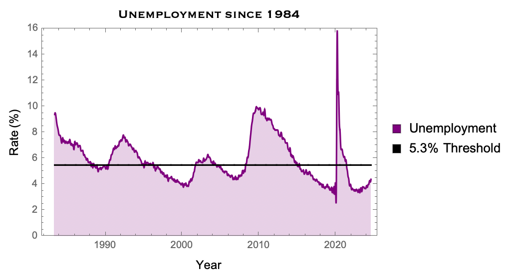
Let’s take a closer look with some real data, and use this to backtest a curve for the stock market over the past 30 years. We can just focus in on unemployment over the past 40 years (since 1984):
As we mentioned before, as revenues fall, and net incomes contract, costs will lag slightly. So the better indicator for stock market performance is the trailing twelve-month average (TTM) of unemployment, which should be roughly anti-correlated with equity valuation.
Over the same period, this can be found in the following plot (notice the 12 month lag):
Now we can fit this to a series of sinusoids (just like last newsletter) to start constraining our model to cycles in the equity markets:
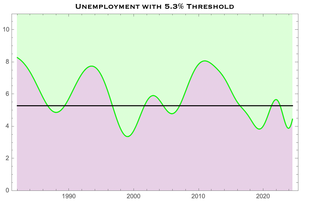
Note that the spikes of 2008 and 2020 get smoothed out giving us the average peaks closer to 8% and 6%, respectively.
This is where the magic happens.
As we have emphasized, unemployment is a fairly good proxy for how the stock market deviates from its annualized growth rate (doubling about every 8 years). Unemployment is a result of cost cutting in the private sector, and done so in a way that keeps profits fixed.
Since payroll + cost of labor is usually about 30% of operating expenses, we need to rescale unemployment by a factor of 1/3 to account for commensurate drop in revenues. So we can take the inverse of the unemployment rate, and rescale appropriately, giving us the following:
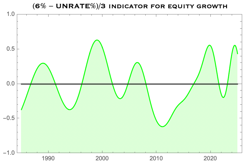
Now we’re cooking.
Now we can peg the median line (in black) to the annualized growth rate of the S&P and apply these fluctuations to an actual compounding curve.
This is what we find:
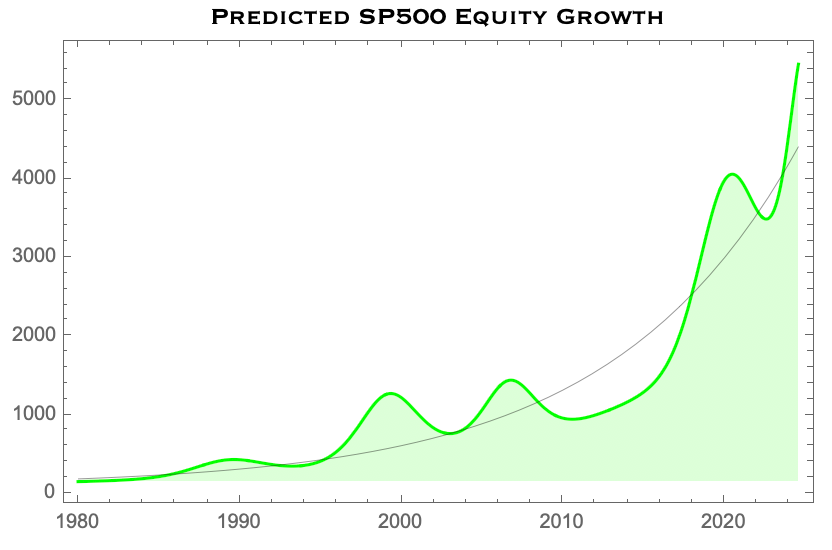
Remarkably, this compares incredibly well to the actual S&P 500 over the last 40 years:
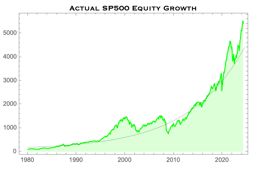
Pretty good! With our model in hand we are prepared to start making some projections for what to expect in this next rate cut cycle.
Some Projections
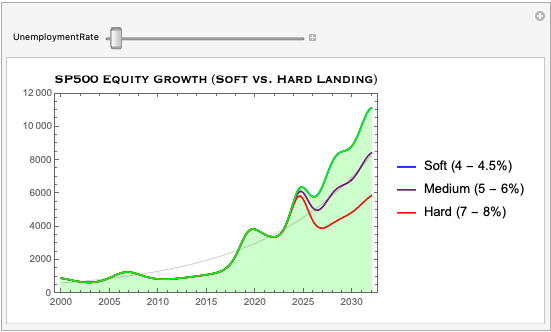
Remember, once rates get cut, the economy typically will fall into some sort of recession. Economists and the Fed like to break this down into a “soft” versus a “hard” landing. Now that we’ve built this framework, we can simulate different outcomes for the stock market based on unemployment trends:
Soft Landing (4-4.5% unemployment): Under this scenario, the stock market would likely see a mild contraction of about 5-10% over a 12-month period. However, equities should recover quickly, with annualized growth rates returning to the 8-10% range as the economy stabilizes.
Medium Landing (5-6% unemployment): A moderate increase in unemployment could trigger a more substantial market correction, perhaps in the range of 20-25%. This would correspond with more prolonged GDP stagnation, delaying a recovery in stock prices until around year 3 of the recession.
Hard Landing (7%+ unemployment): In the event of a hard landing, we would expect a significant market decline — possibly up to 30-50%. In this case, it might take up to five years for the market to return to its previous highs, with much of the recovery dependent on aggressive monetary policy interventions.
By fitting these unemployment peaks into our model, we can project an expected range of stock market behavior in the near term. While these are general trends, they give us a clearer sense of how macroeconomic factors could impact public equities in the years ahead.
Below is the projected growth in US public equities for the next 8 years given where they currently stand, along with the yet-to-be-seen employment data:
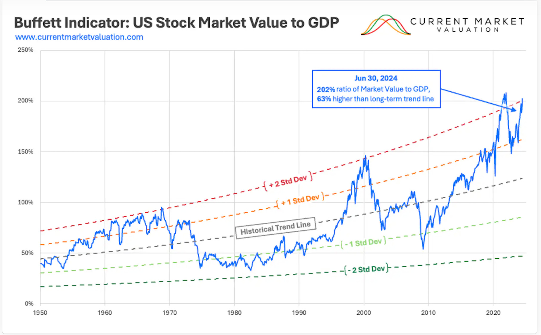
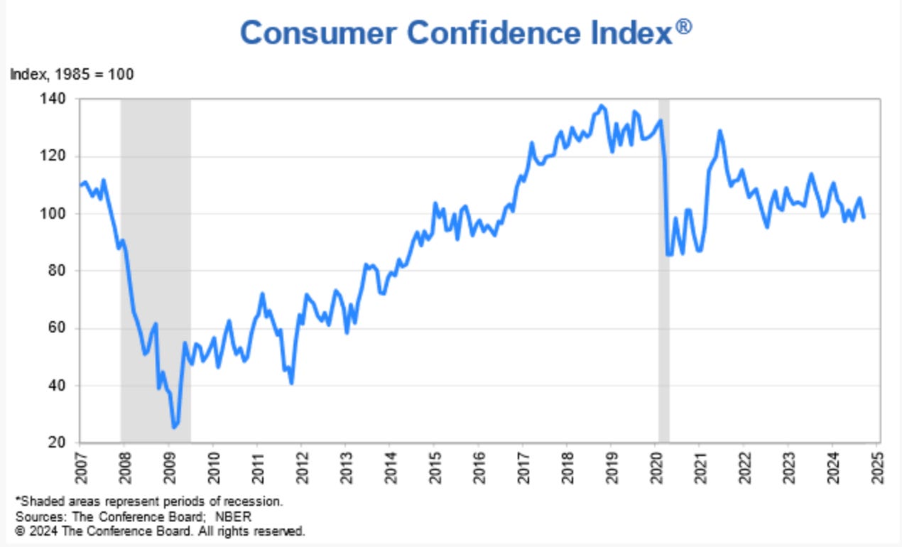
I’m not going to make any decisive claims about which one of the trajectories we will see in the near term. However, I will note that everyone seems to think that we are approaching a soft landing (which would be fantastic!) — despite a bunch of indicators suggesting otherwise:
PE ratios are at all time highs (for non-recession values)
The Buffet Indicator has eclipsed 200%
Consumer Confidence is below where it was back in 2007
among others — but who knows. I don’t spend my time studying market dynamics nearly to the same extent as economists, asset managers, and Fed governors do. I just know a little math & physics and occasionally I use that to understand business metrics and financial data.
So take all this with a grain of salt. Sometimes it’s best to leave it to the experts.


In Summary
I’ll just close with some lessons from today’s newsletter.
Lesson 1: The TTM average for unemployment is anti-correlated with the valuation of public equities (since S&P slightly leads unemployment).
Lesson 2: PE ratios and profit margins among the S&P 500 companies are I&D (invariant & dimensionless) quantities. The market responds to keep them invariant
Lesson 3: Across industries, dividend bearing stocks have PE Ratios of about 20-30, and profit margins of about 11% on average (depending on the industry.
Lesson 4: Using these lessons, we built this model:
\(\boxed{P_{\text{S&P}}(Y) = 17.1 \bigg[1.092 + 0.32(0.053-R(Y)) + X^{\text{Levy}}_\nu\bigg]^{(Y-1928)}}\)Lesson 5: This model tells us that when GDP declines, revenues decline, and unemployment rises in turn. This process continues until the economy’s supply matches demand, which stabilizes revenues, and facilitates rising employment levels once again.
The cycle continues.
Reflecting on my middle-school paper trading experience, I can see now that much of the "success" I had was due to market timing, rather than any deep insight into economic fundamentals. I was riding the coattails of a market that was recovering from historic lows, completely unaware of the macro-trends driving my results.
In today’s environment, with interest rate cuts and economic uncertainty on the horizon, we face similar market dynamics — but now with the benefit of hindsight, data-driven models, and plenty of physical insight.
While no projection is ever guaranteed, being aware of these cycles and the indicators that drive them gives us a better chance to navigate the complexity of public equities in the years to come. Thanks for tuning in.
This is Math Meets Money